This Blog is originally posted on WebAlive.
Imagine you are the owner of a small physical shop. Sitting in the counter. A customer entered and picked up 8/10 items. When he came to your counter, You smiled and gave some extra offers seeing his curt. Then suddenly he left your shop without purchasing anything.
Isn’t it a painful story as an owner?
It happens often with your online shop if you are not offering an easy checkout process.
According to Bymard statistics, the average shopping cart abandonment rate was 69.57% in 2019.

However, some of them are visiting to compare the price, saving for later, exploring gift options. These are mostly unavoidable cart abandonments.
But the rest of abandonment can be reduced by taking some good initiatives on your cart page.
If you want to improve the shopping experience in your online store but not sure why your customers are leaving their cart filled without buying anything, this article may help you to gather some tips.
Please consider all these points that can help to reduce user frustration during the whole process, but in the end, your checkout flow should be based on your user’s pattern.
Eliminate distractions and show the right grading
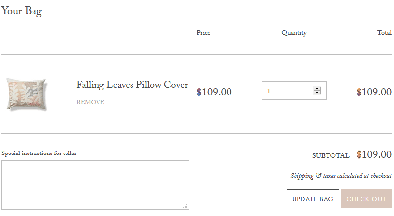
If your customer already arrived on the checkout page, that means he/she decided to make the purchase (in most cases, to be honest). So your shopping cart area should be clean. And for God’s sake! Let’s not use GIF animation in the checkout page to show new year or Christmas offers! They only divert your customers.
Imagine your checkout page as a quiet chilled AC room where you can take decision peacefully.
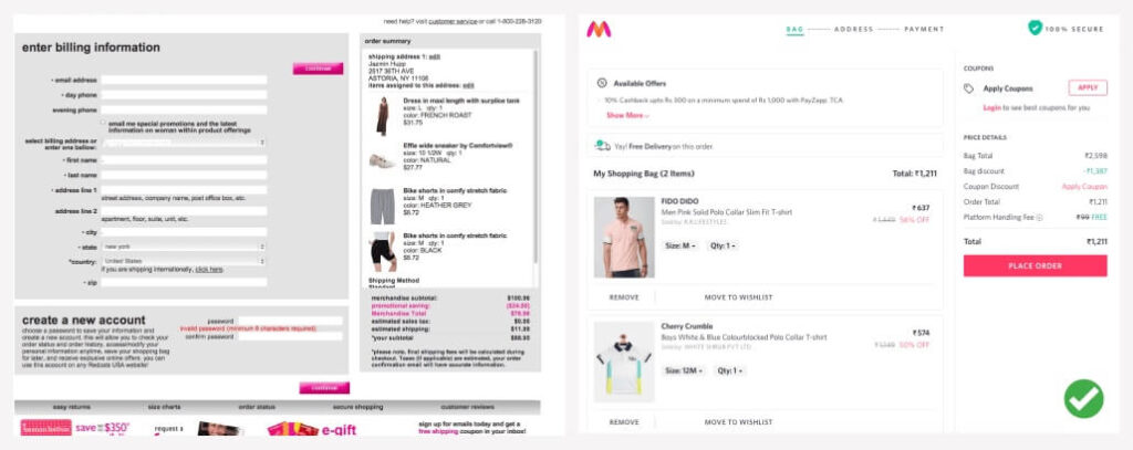
Another example.
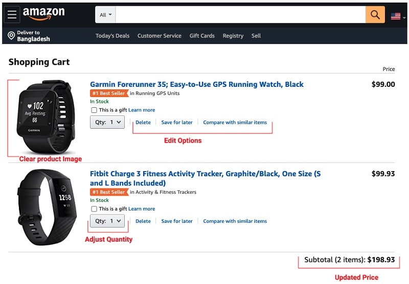
On the other hand, showing the right grading means the user can see what they are buying and giving them full control over all the actions. We must show the following options in a clean and organised way.
- Product photo with title
- Product quantity (Full control to change it)
- About the delivery times
- All possible options
You customer should be able to see all those options as well as edit them with no complexity.
Split your checkout process
Filling a form is boring or maybe underrated, but the form is possibly the most important component to complete the checkout process without any error.

When your customer comes to your checkout page, you don’t want them to overwhelm with endless walls of input fields.
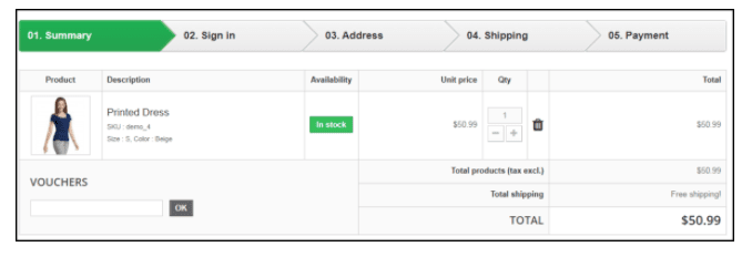
Instead, we can split the checkout into small chunks. So they can see uncluttered checkout pages. This way, the structure will look clean because you haven’t shown too many objects on a page. The visual hierarchy will play a vital role here.
One thing to keep in mind, it’s ideal if you can complete the full process with fewer steps.
Checkout without registration
Most of the customers come to your shop with a single intent. They search for the product. Take it to the checkout and purchase the item. It is very frustrating for them to see a popup or a signup form at this point.
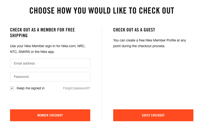
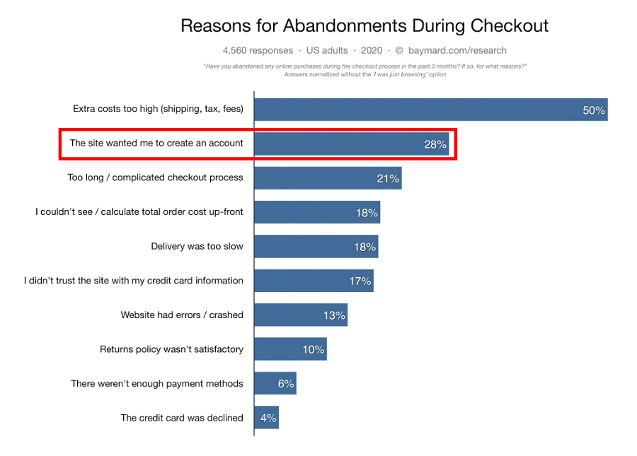
Overall if you allow guest checkout, for some people the process will be simpler and help them get what they’re looking to purchase, faster. As you can see, 28% of abandonments in 2020 happened because of not having a guest checkout option.
Show progress bars to your customer
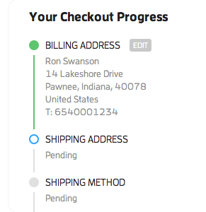
During the checkout process, people often assume they have a long way to go and give up the process after one or two steps. Here progress bar helps them to understand how close they are to complete the order.


💡 The key things to note
- It has to indicate where the user is and how much there is to do to complete a purchase.
- Make it clearly noticeable.
- It must indicate their completion levels.
Keep the form files clean
Do not ask for unnecessary information during the checkout. This design of your form will impact the full checkout process. A well-designed form can show your users that your brand is helpful and professional and enjoyable.
So keep your form straightforward. Of course, some fields are mandatory, like email and address. But ask yourself, do you really need his date of birth to purchase dog food?
Hide layered navigation during the checkout process
The main purpose of layered navigation is to help customers in searching and locating products. However, it can distract the customer during the checkout process.
If you hide the layered navigation in the checkout, it will also keep the checkout page clean and hold the customers’ focus on their selected products, it’s pricing, and moving forward to the final step.

Fully functional “Back” button
Sometimes people press the back button to get back to the product page or to add a new one. If the Back button is not functional, it means the site may throw an error message.
This affects shopper’s experience negatively. Even it can turn into frustration if the user has to fill-up the form again.
Saving the user’s data can solve this issue. Which means anytime they come back will see the form as they left earlier.
Provide a summary of purchasing items
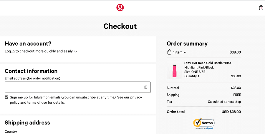
Showing the ordered items in a summary helps them to double-check if they are purchasing the right items and right quantity. Should also show the delivery and total price.
This is very important to show every step of the checkout process.
Be transparent about charges. Let them know upfront
Showing shipping charges, taxes, or other charges on the last page can be very distracting. This makes your customer have a second thought and causes cart abandonment.
We should understand customer expectations that they want to know upfront how much things will cost them and what is the delivery time.
Show the payment option available at a very early stage. Some sites are putting it all the time in the footer of every page. It helps the customer to decide in early-stage how he can clear the payment.
To conclude
I hope this article will help you to pick some ideas that can boost your conversion and lead to higher sales. E-commerce business highly depends on how smoothly your customer can complete their checkout.
However, keep that in mind that context is very important when you are designing checkout experience. Do proper user research, gather information, then decide based on your context. Do not forget to do user testing. It’s always worth it for the ecommerce checkout process.
For example,
- Do you really need a Multi-page checkout? Or Single Page Checkout can get the job done?
- Does your user need a subscription offer?
- How will you place the coupon or promo code?
Did I discuss these questions’ answer? Not really, because mostly these depend on your research outcome.
So by preventing all barriers, let’s provide our customers simple and convenient experience as we all want our customers to be happy with their shopping experience.

A UI/UX Designer with a background in Business Administration. He loves to explore complex problems and create experiences that work for both businesses and users.
