This Blog is originally posted on WebAlive.
Search is the simplest way to find a piece of information from large scale sites. A basic search consists of an input box to type the query and a Button to submit. We may think, it doesn’t need much of our attention, however, on a heavy content website a good search can serve as a human assistant. You ask for help by typing and you get what you looking for.
Image source: Amazon.com.au
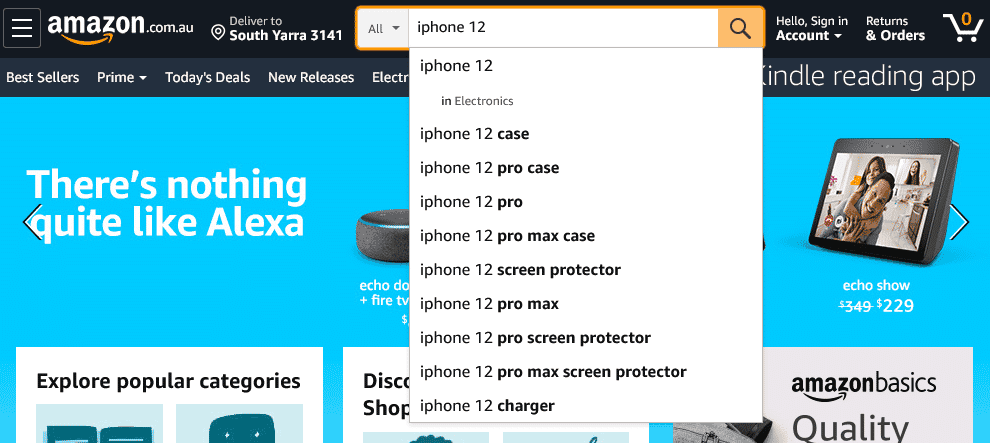
We often find a poorly working search-bar on websites. But it’s not always the functionality or performance of this feature rather it also depends on the user’s skills.
According to Nielsen Norman Group, users have poor search skills and don’t know how search works. Therefore, to offer an effective search we have to consider different users from novices to experts.
Why Search bar is important
Day by day search gaining more popularity than before. We are now having voice assistants search technology like Apple’s Siri or Amazon’s Alexa. More and more ecommerce search now offering image searches. Even nowadays kids know how to search for cartoons on YouTube!
Image source: freepik.com

First, we need to understand why user searches and what users search for. In a content-heavy website users often use the search box to look for particular information. Sometimes to avoid drill down to navigation, some users straightly jump to the search box to save time.
Research from NN Group showed 17 years of search success rates where overall success in 2000 was 64% and increased significantly in 2017 by 92%.
This success rate inspires us to build more powerful search functionality. So that user gets more trust around the site and also get a positive experience. As a result, we will get more returning customers to our sites.
Even for example, in the ecommerce site when users don’t get particular information on the product details page, they go for a search, and if customers can’t find it, then it doesn’t exist.
Bear in mind that if your site’s information architecture is not that friendly your search box can be a 2nd lifeline to hold the user to your website.
Which website need the search functionality
To discover content on your website search is the second-best way after navigation. But if your site is simple one-pagers then the search will play almost no uses. But, there are many sectors where a simple search can play a vital role. For example a data-driven website, a Booking service website, or Job Portal website.
When do users look for Search box
People search when they are confident. When a user wants control their own way and want to walk independently to a website, they directly use the search box.
Studies have shown about 43% of website visitors go immediately to the search box and these searchers are 2-3 times more likely to convert.
On the other hand, some users start with navigation, and then, if they are stuck in a point, they usually jump to the search box. If we shed light on this matter we should make a search bar available on every page.
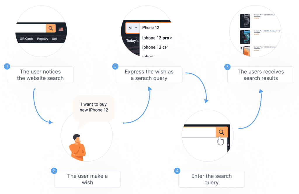
A basic searching steps
When a user begins a search, they’re really starting a journey. A journey that starts with finding the search box to getting a result.
And if they get an expected search result, they can complete the task or purchase. But this all starts with a search.
Visibility of Search box
The users always don’t know where the search box is when they enter a website. Making it visible to every page is very important.
To create a minimalist design, we often place just a search icon that almost disappears with Navigation. This actually increases the cost of interaction. Instead, use an open text field.

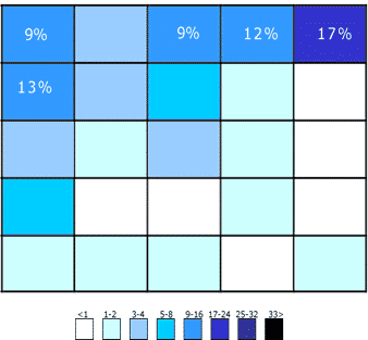
The best place for search feature can be the top bar, which consistently showing on every page. This way it can be seen easily and it will make faster a user’s search process.
A study by A Dawn Shaikh and Keisi Lenz. Where users look for the search icon.
Search Button or Just an Icon
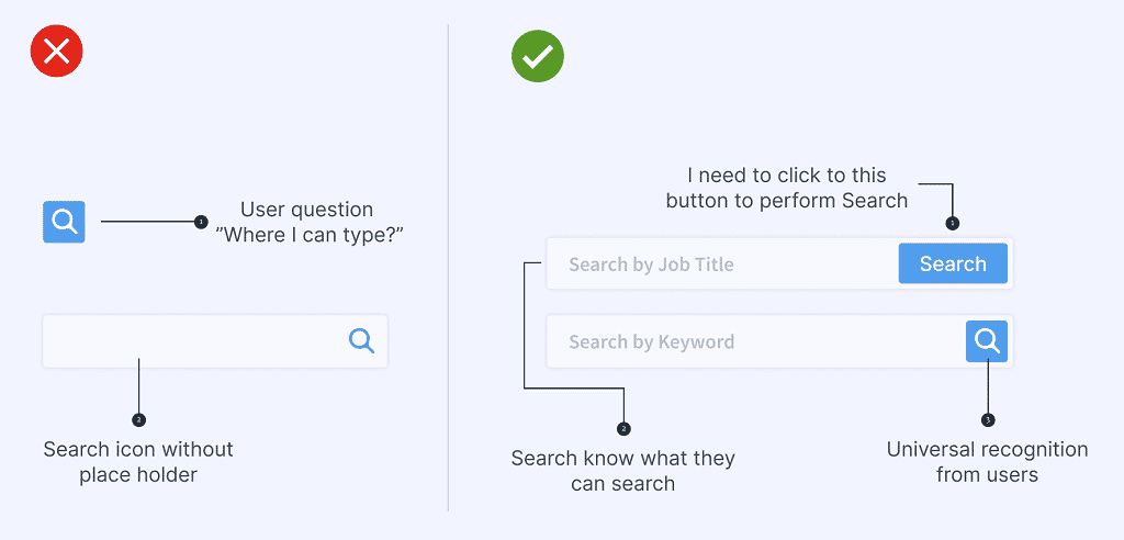
To make the overall site visibility clean and modern we often show an icon right beside the search box. Some users may not recognize it as a button rather than an identifier of the search only. A clear Search button tells the user how to execute the search.
Enough space to type the query
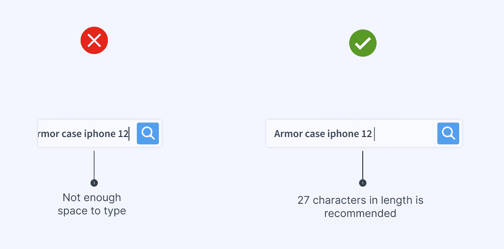
The first step of the search query is typing and typing is pretty effortful. So our search should provide enough space to type a query of the user. According to NN/g research on an ecommerce site, users typed 14.5 characters on average. So they encouraged to use 27 characters in the length of a search box.
However, a standard search length may vary from site to site. The best option could be researched on the site’s search log to check how long users’ queries are.
Provide hints on what your user can search
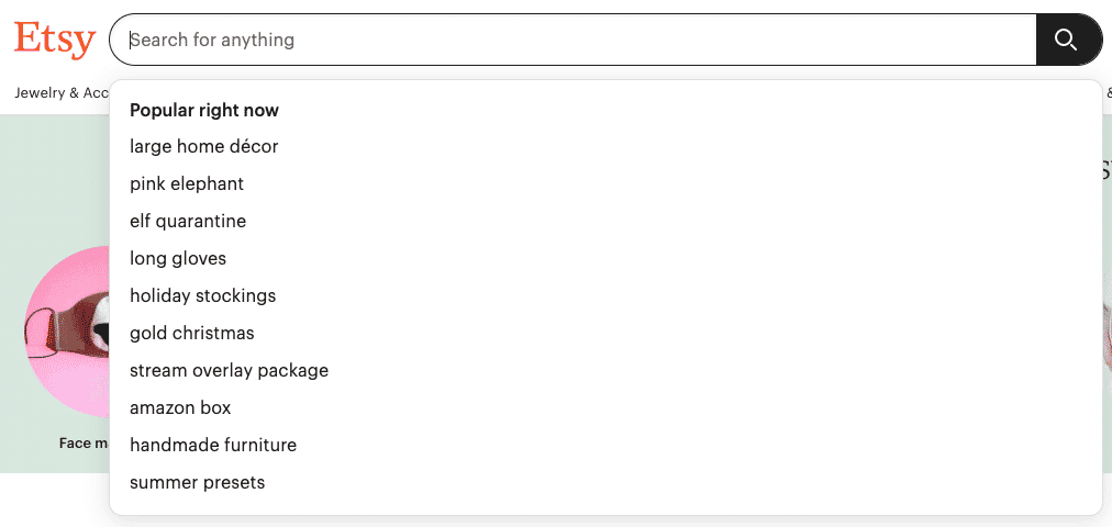
We can write something helpful to our users about what they can search for. Providing search example as placeholder can be a good approach here so the user can see the key search categories before they start typing.


Keep it simple but useable
When a user searches for something by default users expect that they can simply enter a term, any term, and get the meaningful search.
So let’s not confuse our user by offering too many options around the search like filler text or a big chunk of instructions. Keep it simple.
The process should feel like a human experience that can quickly guide them.
Provide advance search
Advanced search helps to find something from a large data. It helps to narrows down the result.
If we are offering an advance search option first thing to make sure it’s not overlapping the simple search option. Because the most user will prefer the simple search.
An ideal advance search can be using a distinct link that is less prominent than the basic search. We can place the link somewhere closer to the basic search box so a user can find it easily.

Keep the user’s query on the result page
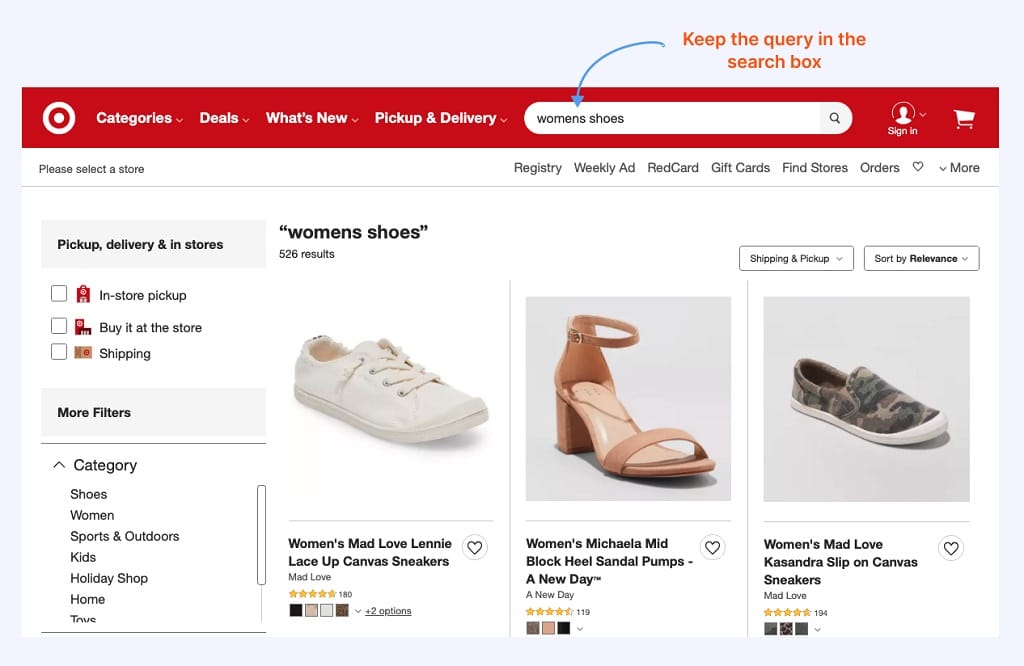
While showing the search result it is important to show what they searched for. This helps them to refine the query if the result not showing exactly as they expected or even showing less or too much data.
Source: target.com
There is a high risk that when a user performs a search, they’re going to get no results. While keeping query in the search box help them to notice that instantly. Additionally, if there is no result found, always mention that the search item is not found, otherwise, the user thinks the system is broken.
Conclusion
If you reach the end of this blog, I hope you can pick some points that can help your site search experience. First thing, you can start by taking a deep look at your search log to understand your user behavior and get an idea of how they are using your site search box.
Undoubtedly search is an important feature for any large website or application. Providing a better search experience can help to gain more trust from your customer as well as get more conversions.
Next blog to read “Designing data table for mobile“

A UI/UX Designer with a background in Business Administration. He loves to explore complex problems and create experiences that work for both businesses and users.


