This Blog is originally posted on LinkedIn.
I was about to buy a phone. So I researched a lot about the latest phone that fits into my budget and due to lockdown online shops are the only option for me. I heard about 3 local e-commerce sites most.
So I went to the first one and search for that phone. Once I clicked to the “Buy Now” button, I was forced to Sign Up(Email, Name, Password) page rather than checkout page. I felt bad but still signup as I was very excited. Once I signed in I was surprised to see delivery will take 7-12 days! this was shown after filling up personal information, address form. Although the website home page said they are offering 24 hours express delivery. So I got frustrated and closed that Tab.
💡Findings:
- Poor website information architecture
- miss-leading information
Then I visited the second one. I saw two “Buy Now” buttons in the same viewport and no option to choose phone color. So I clicked to live chat but it was offline…
💡Findings:
- Lack of operational simplicity
- Lack of communication
- Problematic CTA’s
So I went to 3rd one and search that phone with deep frustration I had with the earlier site. But this time I found everything as expected. Their checkout page clearly saying “what” I am about to buy and “when” it will be delivered. So I made the card payment. Within 10mints a representative called and said my phone will be delivered by tomorrow.
💡 Findings:
- Offer a hassle-free checkout option
- Clear data presentation.
- Designed for the mental model.
Result: Two of the top sites just lose a customer, but 3rd one gain profit as well as get a better trust. I believe this happened because of better communication, better user experience, and better information architecture which support users, mental model.
My learnings are,
- Two of these well-known sites spend a lot of time in marketing but very less in customer experience design.
- Having good customer service is more important than a fancy design website. Yes! Banners need to grab user attention but we need to make sure smooth experience too.
- During the journey to order that phone, I didn’t have any thought of what fancy color they used to their site rather, all I was wondering about the phone and how I can purchase it.
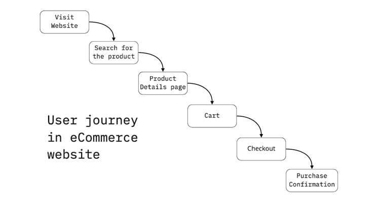
Here is a good example of how a customer feels every step.
I am not saying visual design or marketing is less important! But having a good customer journey is very important for an e-commerce site.
Do you have any thoughts on my journey? Leave your comment 🙂

A UI/UX Designer with a background in Business Administration. He loves to explore complex problems and create experiences that work for both businesses and users.


Pingback: Common UX Design terms | Every designer must know | MI Robin