This Blog is originally posted on LinkedIn.
As you heard from my previous article about my experience in purchasing from the online platform, in this article I will be sharing a story about Sign In experience as an old user.
As I am moving from my old phone to the new one, I started to login to all apps that I use regularly, to my new phone. One of my favorite apps is a news-reading app.
Let me go through step by step of my login experience so you can get a feel as a user and visualize the scenario. In each step, I will be sharing my thoughts from the UX point of view. So keep reading!
As you can see the splash page[01] has this big button to get started. After tapping, the next page[02] offering me to select topics without even signup. That’s a plus! But since I am an old user I choose to click on the “Log In” button to get my account.
💡 Key things about Splash screen
- No unnecessary content
- No distraction
- Use a single color logo
Now there is a lot of debate about the splash screen necessity. But we are not going to discuss it here.
💡 Key things about Welcome screen
- People don’t like to register for things in the first place without knowing the app due to spam and messages to their inbox. So offering content first then signup later is a good option to get “Genuine users”
- To achieve Genuine Users, we have to make sure our guest user know what are the advantages of Sign Up. This is very important!
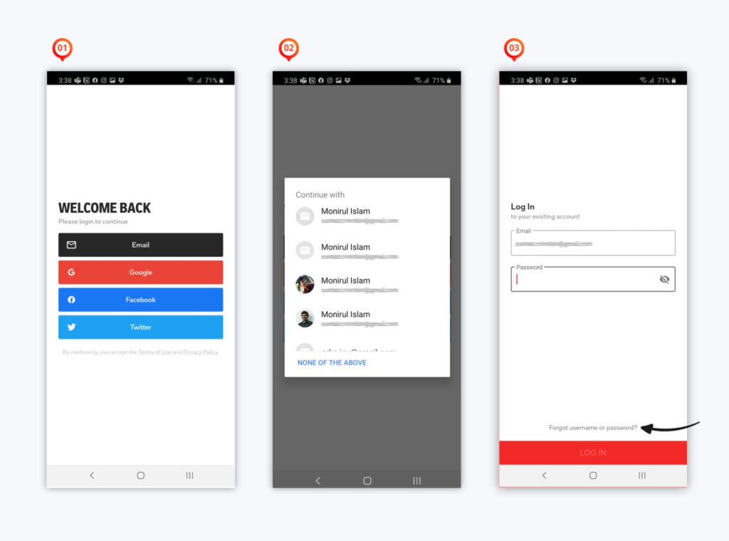
Let’s get back to the scenario. Once I clicked to the “Log In” button it gave me login options[01]. After tapping “Email” it asked me to sign-in through my current account I have on my mobile.
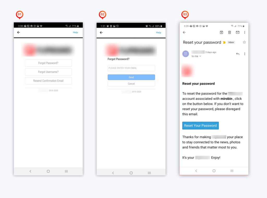
Honestly, I was expecting the 3rd page where I will put email and password. But that’s ok since It saved time from typing as we can see it already filled up my email there. This stage I realized I forgot the password. So I took the help of that tiny little text that says “Forgot username or password? on page 3
The next pages were perfect as expected. Like, send you the reset link to your email address and change your password.
So at this stage, I did everything perfectly and apps asked me to get back to the login page and try to log in again.
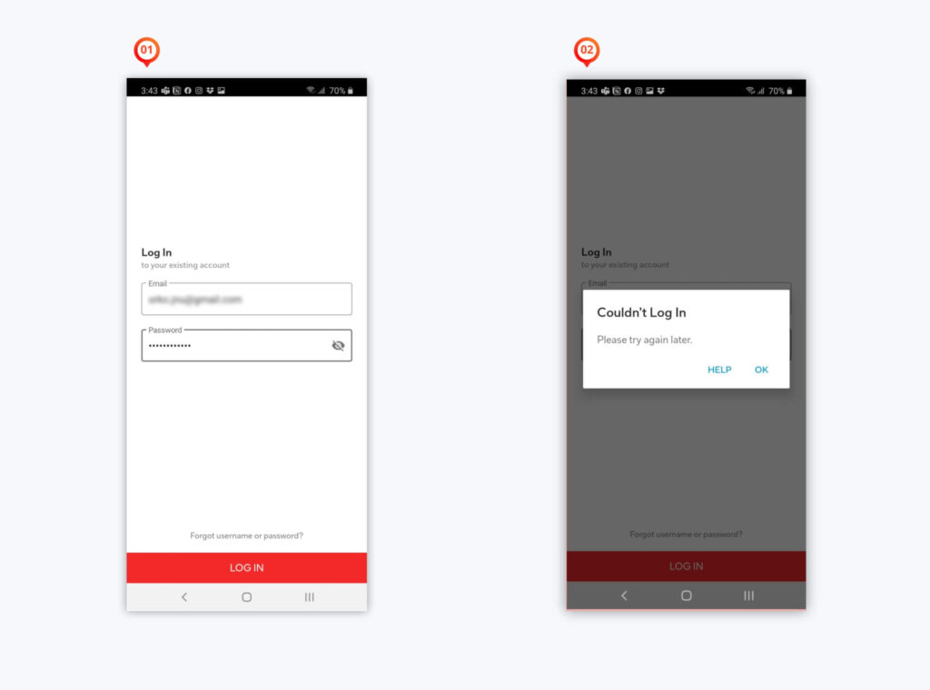
After providing my email and new password this popup showed[2]. Now imagine how I was feeling as a user at this stage. I already invested my time to recover my account, changed my password but no hope. Also, this page is not saying I provided the wrong email or password rather it’s asking me “Try again later.”
💡 Key Problems
- It’s not handling the user’s wrong actions gracefully.
- The error message is ambiguous
What if the message delivered like this to the user
So for the last time, I thought to try with my user name instead of my email address however that login page only had Email and Password input filed.
Surprisingly it signed in[2]. So it was expecting me to put the username in the email field. How I guessed that? looking at that tiny cute little text saying “Forget username or password” and from my reset email.
But the big question is, Can we have a better approach here? The label should behave as it says. If it is asking email defiantly I will only put an email address right?
Here are my thoughts about the journey.
- Single wrong labeling can discourage your user from your app within a minute.
- Field Labels look very small thing but it’s very important to tell the user what the corresponding input field means.
- User mistakes are unavoidable. But the product should handle it gracefully. Be clear and specific about the error message as far as we don’t hurt security.
What I always keep in mind for Form design
- Always try to use a single-column form layout. Everything in left-aligned including the title. But yes as always there is some exceptional.
- If the form is long then divide the form into sections (For example Step 1. Company info. Step 2. Bank details)
- If all fields are mandatory then, no Asterisk icon (*) sign is needed. if few (1/2) fields are mandatory then use Asterisk icon (*) for those. And if few (1/2) fields are optional then say (optional) to those fields only. see the image below to get more clear idea.
- Take good care of Date, Dropdown list(if it is long). Don’t mix the Checkbox with the Radio button. Their purpose are different.
- Be specific to error text. Don’t blame your user. be grateful.
- Avoid showing error after submitting.
- Always do User Testing. No one there? Ask me I will do it for you. 😀
What do you do to avoid reset password? or want to add anything about Form Design?
Add your thoughts in the comments below!

A UI/UX Designer with a background in Business Administration. He loves to explore complex problems and create experiences that work for both businesses and users.


