Ignite - eLearning Platform
Overview
IGNITE is a startup that aims to make an eLearning platform that can provide educational courses or training programs.
Time: 6 Months
To comply with my non-disclosure agreement, I have omitted and obfuscated confidential information in this case study. The information in this case study is my own and uploaded by the permission of the company.
The Challenge
To create a central location for all of the students, Support trainees by making lessons easy to follow, communicate with each other and providing a consistent environment.
Project Process
CORE Brand Attributes
In this section take the time through a UX facilitation workshop to understand the brand across six different areas. So by brand attribute, I came up with the idea how brand trying to communicate.

Example:
The company provides eLearning platform to Responsible user in an organized environment in Helpful voice. It offers timely support to trainees by making lessons easy to follow, increase accountability and engagement.
The company provides eLearning platform to ............... user in ............... environment in ............... voice. It offers timely support to trainees by making lessons easy to follow, increase ............... and ................
Project Goal
A powerful eLearning platform which would adopt a business perspective, consider the primary objectives. The platform should easy for an instructor to train students in a systematic way and create a collaborative environment among the students.
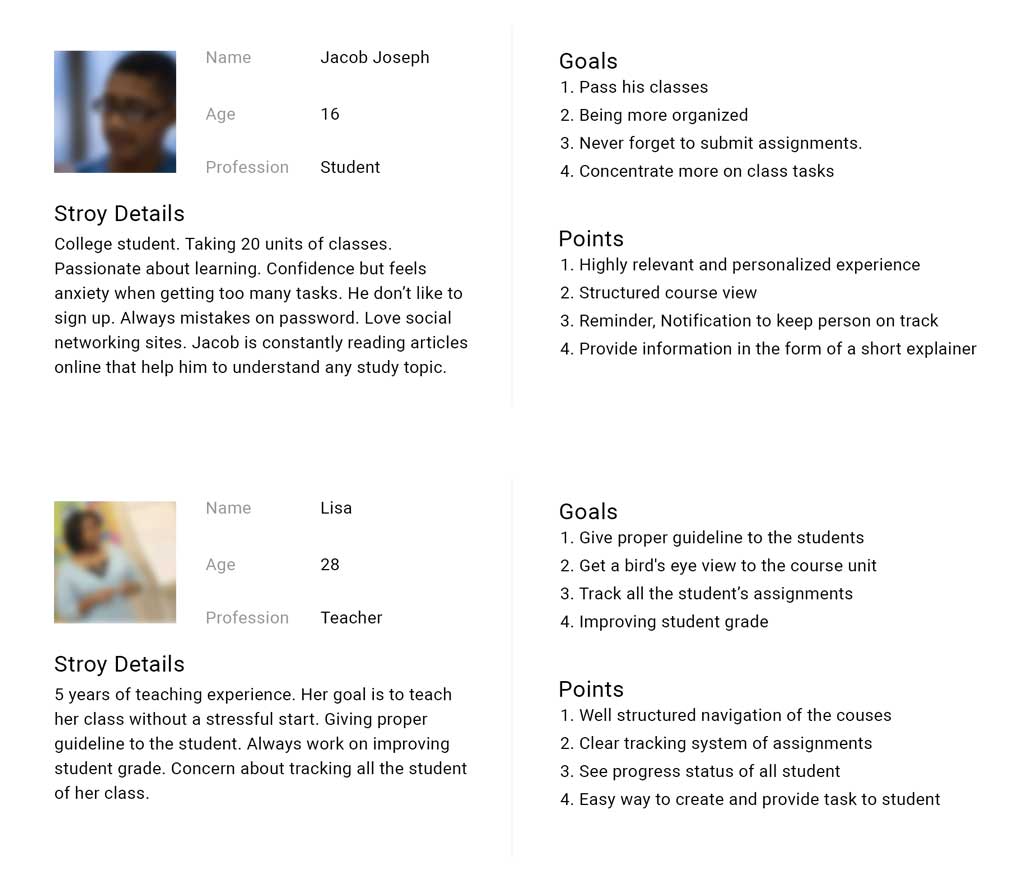
User Profile & Story

Competitive Analysis
Competitor analysis is based on two parts. Knowing what we are looking for and organize the collected information that can be utilized. The big challenge here is to find out the market gaps. Listing what users are using right now and what kind of problem there are facing. Since one part of the user looking for bird eyes view, we were about to introduce Kanban view for them. So in the competitive analysis, we had to find out the best kanban model could be and what others are using in the market.
On the other side, students want to get the task and submit an assignment without hassle. Also, they want to make sure if their grades are updated or not. So the personalized structure and notification are important. So we found out a rough flow how the student can get the task, submit and track their grade.
For both tasks, I tracked down all our gathered information in a spreadsheet for further research for the marketing team. During the research, I am glad that I found proper help to get the list of competitor name like Google classroom, Blackboard, Canvas and Brightspace and research details of their product.
During my research others came up with reports and a lot of idea to include. The challenging part here is to synchronize information and introduce only those features which are matched to our user profile.
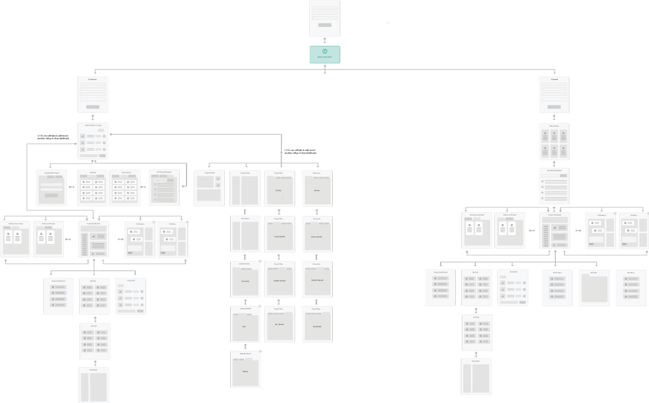
Information Architecture

Visual Design
This stage I have designed hundreds of UI pages and uploaded to Invision (Prototype App). For the sake of presentation, I am giving a glimpse of what I have done so far.

Outcome
The dashboard increased efficiency and accuracy for both Student and Teachers. The platform has helped the teachers to manage all the tasks, assignments and connecting to the students in one single platform. During our user testing, we find students are very much excited with submitting assignment processes, getting notified about their grading and connecting directly with their teacher.
We are continuously monitory user behavior with the product using tools like Hotjar. Currently, we are working on integrating advanced analytics and chatbots.