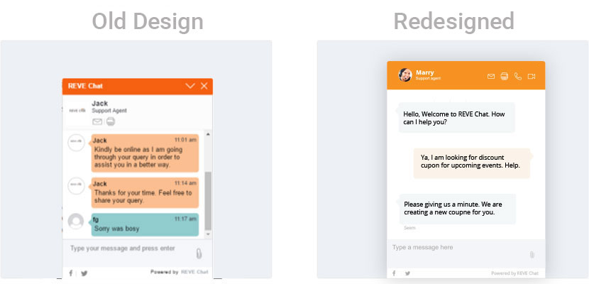
Overview
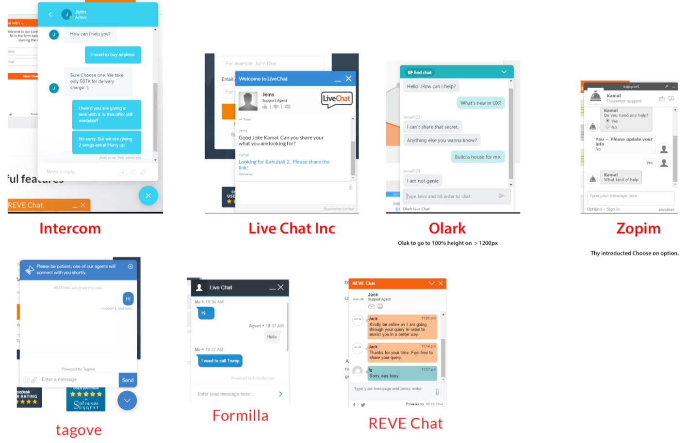
Fast developed REVE Chat required a complete redesign of the Chat Interface. As a part of Young team I had been assigned to create competitor analysis report and based on modern trend create a chat window that will be clean.
Time: 1 weeks
To comply with my non-disclosure agreement, I have omitted and obfuscated confidential information in this case study. The information in this case study is my own and uploaded by the permission of the company.
My Role
I was responsible to competitor analysis report, giving a solution and create the Visual design.
The Challenge
The main challenge is to redesign the interface by miking minimum changes in HTML structure.
Project Process
Competitor and where we are
Typography, Colors, icons
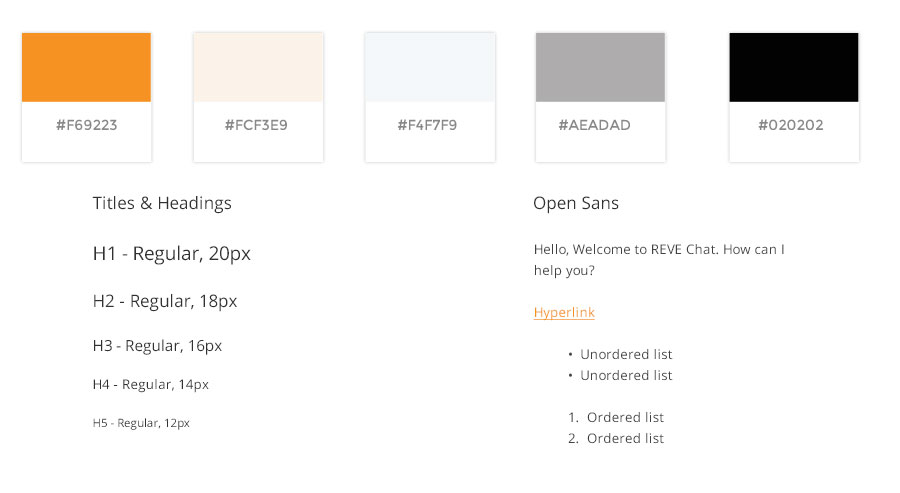
I talked to developer team and logically convinced them to change the icons and using SVG.
Creating Visual Design
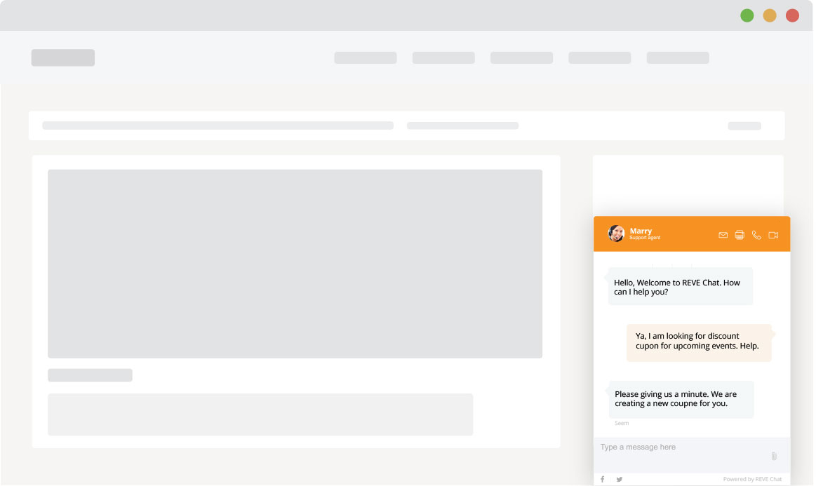
I was told to create different versions by keeping HTML almost same. And here it is what I came up with.

Reflection
Going from very old design to desire result was not easy. In the whole process I had to do A/B testing to choose one option. Since A/B testing is a bit expensive so I tried with colleagues, support managers who are dealing clients, helped us out. At the end I was able to create a design which is modern and clean.
